Data Discovery Interface
Data Discovery is an application designed for browsing OLAP cubes. It fulfills the roles of both a report viewer for reports built on cube data sources as well as an ad-hoc data analytics tool for analyzing data stored in cubes. By virtue of this dual role, it provides a powerful and extremely convenient fusion of both functions which tends to be the most efficient and synergistic way to perform cube-based data analytics and mining.
- On the one extreme, for advanced users, Data Discovery offers the opportunity to quickly and easily build data analyses using the standard "slice, dice and drill down" functions strongly associated with OLAP. When these analyses are saved for future use, they immediately become a library of reports that can be shared with others.
- On the other extreme, for standard users who prefer to simply consume these reports, Data Discovery becomes a viewer which allows them to open and view dynamic and live cube content.
- For those in between, the Data Discovery provides an opportunity to open predefined reports and then to continue with train-of-thought analytics - slicing and dicing content to answer the questions behind the report.
Data Discovery Interface
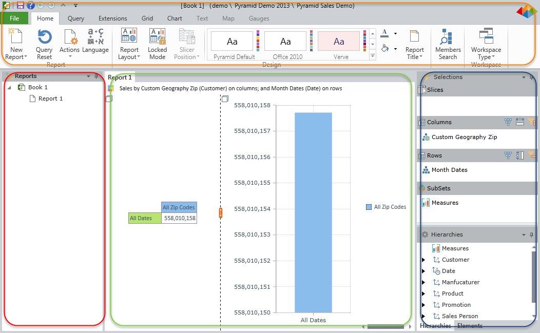
Once inside the Data Discovery interface, the user is presented with several panels (some of which may be initially hidden).
- CONSUMER clients are given the lighter 'viewer' workspace layout.
- ANALYSTS and PROFESSIONAL users are given the more technical 'analytic' workspace layout.
- Alternative workspaces include the dashboard workspace and the "legacy" workspace. See Workspaces for more detail.
The main panels are described briefly below.

Data Discovery Interface Panels
The Ribbon Panel (orange highlight)
All the application's commands are presented through the ribbon interface at the top of the workspace. (Note that consumers will see this ribbon initially in its collapsed form.) Each tab of the ribbon provides access to the different functions of the application. This is described in detail here.
The Report Panel (red highlight)
This panel, usually on the far left of the screen, shows a hierarchical tree listing of all the reports contained within the current book. When consumers login initially, this panel is exposed. Reports can be nested in report folders for better organization and presentation purposes. Clicking on a report will load it up in the Report Panel. Users can make various changes to the report tree structure within this panel. This is described in detail here.
The Report Canvas (green highlight)
This Report Canvas presents the rendered query as a report to the end user. The report canvas has numerous layout and formatting options that can be controlled from the Ribbon. The report and its underlying query can be further dissected - "sliced, diced and drilled" - by using both the report context menus (right click menus) and the metadata selection and hierarchy trees. The report canvas is described in detail here. The report canvas is comprised of one or more panes, each of which houses a report component: charts, grids, textboxes , maps, gauges and slicers.
The Selection, Hierarchy and Element Panels (blue highlight)
These panels provide users with the most detailed method of changing a report's underlying query.
- The selection panel allows an end user to add, edit and remove different dimensions and hierarchies from the query by changing the 4 main parts of a query in Pyramid: slicers, sub-sets, rows and columns.
- The hierarchy tree panels allows an end user to drag-and-drop hierarchies to and from the selections panel;
- The element tree panel allows users to select elements in a given hierarchy on group basis (e.g. by level) or at granular, singular element basis.
The selection and hierarchy trees are described here in detail.
Home |
Table of Contents |
Index |
User Community
Pyramid Analytics © 2011-2022

